…..
As a critic of interfaces, you’ve already defined the parts of dem411.com that you like or dislike upon landing. Small decisive moments in Internet communications, generally hidden and unspectacular, occur inside an intuitive split second, and every web user naturally qualifies to judge their experience. If you’re not a web designer, but need to make a personal or small business web site using your own content, setting up a customized blueprint like dem411 is probably doable in the US$3,500 to US$5,000 range. Woven into the more universal findings presented below are details about its build and project timeline.
This article is full of complaints—a few of which might be deep enough to learn from—but skews positive in showing how I conditionally received more than expected in the final result. Some web sites have full 24-hour support on multiple continents, replete with outside design houses sprinkling turbo on the visual imprint—fancy dev. Not saying it’s onerous, because they rep the bleeding edge of technology and design. But such lofty, expensive goals refreshingly fade away with respect to a solo and brief web-building project; the small budget; the need for a semi-transparent way to freely control content within the context of a personal web archive—additive over time, easy to edit and manipulate; and melding that data structure to a kind of timeless, minimalist design. The one I had in mind wasn’t technically feasible. A larger budget would have solved a couple issues, but money couldn’t cure a handful of hard-bitten trade-offs that breed web design conformity; these things piled up in the service of “future-proofing” the back-end structure of it all.
PART I: Nine Observations on Creativity and Web Design
1. One cardinal rule for designing a website isn’t technical at all, and sounds similar to one of life’s more pervasive truisms: There will often be a stereotypical crisis in the starting blocks of an idea, when you realize you can’t seem to square the scope of your ambition with the given limits. On the non-existential side of this analogy, web design pitches you into a labyrinthine chicane of dictates and confines defined by computer science, its code, software and flat quadrilaterals. Traversing the narrows sterilizes well-intentioned notions of deeper stylization and customization, and reduces the art of it. The hook is that you still want to be a part of it, a powerful new medium. Zen-dada types would say this moment allows you to explore the power of creative disappointment in accepting limitations. Many others just say this seems like a bleak time for well-designed online content.
Through the pessimist’s lens dem411.com harbors compromise, disappointment and failure—necessary sins of technical constraint that bring structure to its interface (a.k.a, front end or “presentation layer”), as well as the back-end code or “data access layer.” Everyone will inevitably judge exactly how well you’ve fine-tuned your visual abstraction between the front and back ends—how has it clarified or convoluted the site’s user-friendliness? This can all be measured coldly and in exact percentages. A positive ethos arises and is most balanced when it keeps you from clinging to unrealistic ideals, and it shows in the designer’s approach between these layers. The practical act of maximizing the content control, flexibility and delivery—plus future-proofing a web site across any platform or device—kicks up a rooster-tail of dirty design byproducts via the easy leverage of CMSs (content management systems), the strictures of bespoke WordPress (WP) template/theme development, and the subtle aesthetic cruelties of Responsive Web Design (RWD). These bits are also tethered to the Cascading Style Sheets language, CSS3 in particular.
The idea to have a simple but visually thought-provoking archival node is tied to the fact that dem411 integrates all of these state-of-the-art tools with customized developer code, site zones that aren’t tied explicitly to WP (e.g., the home page and navigation), the addition of light parallax effects and a unique web font overlay. This wild bunch has to play nice together. Any R&D you invest in these techniques will leave you circling the loudest and most unavoidable warning for modern web design—not adopting RWD is digital suicide. With this secret sauce we seek to create distinction and a special feeling on the fringes of convention. Such ideals sound like useless garbage to millions of one-size-fits-all template websites and rapidly-evolving artificial intelligence (AI) such as The Grid that now assail the dusty old concept of human-based web design as quaintly flawed and irrelevant. A skein of humanistic beauty inherent in creative web design will persevere within and alongside the AI matrix, so long as the desire remains tantalizing enough. In the meantime, it is stimulating to examine the lucidity of antithesis wafting in from hyperventilating bloggers who rush to declare Why Web Design is Dead.
2. Web pages are digital presentations of human continuous-signal thoughts and visions. There is a massive Venn diagram leading up to this, whose origins go back to Paleolithic times. Tracing forward through the millennia from the caves of Lascaux (France), the naturalistic minimalism of ancient Japanese tradition, 20th century Bauhaus art/architectural drawings (Germany) and a constellation of their like-minded disciplines and movements both before and after, two-dimensional design could be seen as simplicity of aesthetic, or attempts to stabilize chaos in meaning through form, color, shape and arrangement. The apotheosis of such an aesthetic has a moral quality to it, a perception that looks into the nature of truth and reveals the inner qualities of materials and objects for “the essence.” In a way, nothing has changed over the millennia—long-dead artists once dreamt of achievement in drawing the cleanest, freshest line through the untracked snow of a blank surface. Being original coaxes primacy out of creative design, and will always count.
3. Web design is more like building a house than other 2D formats. Much as the 3D aesthetic of structural architecture requires additional steps toward function and material selection in ways that books, newspapers and magazines do not, 2D design when pressed into active Internet layouts requires exacting regard for hidden depth. The web site that offers no hassle in its navigation, visual impact and information delivery is furtively built upon gnarled catacombs of code, an array of software tools and the ideas of those who’ve developed expertise in both. As the designer or builder, the web page is Exhibit A in your ability to distill and mask technical complexity on the noisy back-end warpath to a subtle, smooth, angular delivery of ideas, visuals and sound. “Here be dragons,” no doubt, counting several million ways to botch the concept or implementation, the myriad blind alleys of contrivance, and the overly template-addled designs that litter cyberspace and force conundrums of layout, function and disagreement between the site’s elements. At times, it’s a menacing process for the unwary, where The Code is highly rational but can also feel confrontational and unyielding, looming nonsensically and contraption-like at the end of your content creation fever dream.
4. In obtaining optimal control of the web presence, it is essential to own the entire presence. That means full domain/licensing, self-appointed hosting services and clear content ownership down to the foundation (this point expands on the concept of control as discussed in #1). This topic deserves a more detailed spotlight, but slapping the bottom line: If you want any sort of protection on your work, don’t set up your content directly on sites like Squarespace or Medium. They couldn’t care less about the words you write; they’re harvesting your ideas and personal profile for brand and advertising profits.
5. Don’t betray your core ideas while realizing you might need more than one brain to do it right in this age. Within modern web design lie massive complexities of analog and digital idea boards, programming and collaboration. As a solo endeavor, building a modern web site is not advisable. What was once feasible for autodidactic loners at the turn of the 21st century—aided by basic tools such as HTML editors, Macromedia Dreamweaver and the Adobe suite—is now better done in league with a small crew possessing distinct strengths.
6. It will take longer to collaborate and cost more than you think to build a flexible website that has a unique design and original content. So what justifies the outlay for additional resources? RWD will threaten to suck the soul right out with its boxed, gridded confines, and it is technically challenging. Ye must seek avoidance techniques lest the ever-growing Design Machine co-opt your mojo and usurp the throne. Many websites are produced in repeatable, predictable ways, and pander to a common denominator. We build buckets and templates to hold every kind of content, then move on to the next component of the system. These clearinghouses and assembly lines—these manufactured webscapes—remind us that so much of our best independent writing, web design and other content creation is contributing to a single monolithic platform under the pretense of convenience, distribution and freedom.
In the larger scheme of life, cheap and superficial web content is everywhere, fostered by article-bots and armies of underpaid freelancers who have no budget or support for investigation, research, or anything more than shallow thought. Then we are subjected to their material lacking substance and must also use ad-blocking and tracker-killing software to counteract their Big Data siphon. Additionally, the pressure created by phony data metrics, confirmation biases, fear of risk and mountains of worthless content silences creativity, squeezing expression and emotion right out of the process.
7. Best psychological approach to the project/timeline itself: Be unafraid of making mistakes and showing vulnerability in front of others, but get that knotty mess entirely out of your system before final launch. When the design and execution are on point, the project places you in the “zone” and takes on a hypnotic quality that you simply cannot fake. You’ll feel it as soon as it hits the center of your sensibilities. Perfectionists and OCD lovers unite and bond famously in such working environments. Elsewhere in the collaboration, remember that originality is risky—difficult to quantify and defend.
8. When you find the ones who pick up on your signals and work in harmony, superior results will emerge at the very first step of the process, and will snowball from there. Best-case-scenario has the site owner-producer, the developers and graphic designers sharing a hive-mindedness that fuels itself on this premise: The current project should try to be “the one” that dominates the top rankings in your personal portfolio. We’ve all heard it because it’s elementary and Darwinian: “You’re only as good as your latest piece.” Unless this intent is apparent among all parties, the flow/intensity will be lacking and you’ll find yourself dragging the hired help through instructions they’re not stoked about. You simply cannot reach “the good stuff” until this framework is up and functioning without guide wires or artifice. If you’re not the lead designer, trust the designer’s experience, intuition and intelligence.
9. Allow for multiple enforcers in the build environment. I don’t get jealous, and I understand when it’s not my turn to be the expert. Great ideas are convincing by themselves, and don’t feel retaliatory to the group’s other ideas. You’ll all hear the bell go off in your heads when it happens because it completes you to proceed this way in life, in general.
PART II: Six Items Specific to the Design of dem411.com
1. The un-site, dark web design and Bauhaus-inspired functionality. As an archive of old material, dem411 acknowledges that it’s not chasing numbers. It does not seek to speak the same way to every person. I’ve come to the conclusion that the elite (and the elitists) of the global art and design world appear to gravitate around the following general consensus: “Bad design is a lie that tells you not to mind its existence, and lives among us well disguised. It is a story told poorly, polluted and without surprises.”
In bringing dem411’s subtle but unique look and inner workings to life, some of today’s most common web design conventions were avoided while still adhering to the rigors of the CMS’s scrolling-style user experience. RWD also pushes you in this direction whether you like it or not, because one of the major end goals is to ensure the back-end functionality over time. dem411’s home page layout and visual design is a subtle throwback to the 1990s, when the first impression frequently meant offering visitors a place to rest their eyes in the site’s theme/intention—uncrowded and channeling the best of Bauhaus when it was done right. In this manner RWD actually helps decide something useful beyond itself in the design, despite the aforementioned aesthetic hassles of universal, standardized, modular design/building apparatus. Rarer still, there is no gimmicky search-engine optimization embedded here, no tracking software placed on your system, and no incursions on the end user’s privacy whatsoever.
2. Like dem411, roughly 10% of the world’s web sites use “dark” web design, emphasizing the chiaroscuro of dark backgrounds offset by light-colored text. This was the first step in differentiating the site from the herd, and tonally it carries a certain visual impact that is ideally suitable for a wide range of artists and musicians.
3. Color and nuance (and the value of imperfection): One of dem411’s signature moves is the quiet introduction of “intentional defects” to balance out the sterility of code and convention dictated by the site’s presentation layer. The Internet’s mathematical hierarchy and digital dogma is too bloody perfect. The experimental web designer can be found fleeing rogue from that which runs on staunch, sleek, ultra-QC’ed code that has been bludgeoned with Six-Sigma3 (yes, cubed). Where is the human? Every once in a while you have to dirty-up the process and put some smudges on the laser-cut glass, respectfully tell the fifth and sixth Sigma to get lost, and drink a little river water—“It’s good for ya.”
Too many web sites seek perfection in their pixel arrangements as a means to eliminate noise, smooth the visual field and quicken the download time with small palettes and tight, uncreative specs for organizing the layout. And that’s fine—it serves a unified and utilitarian purpose. Yet when I see this, minor alarms go off and I need to break north. 100% black is too easy, and too ubiquitous. Better to lean dem411 toward the lighter and more pleasant “carbon black” as the anchoring color, then add subtle graphical flaws and textures over the continuous field of solid color beneath it. The home page shows these introduced “errors” if you look closely at the background and central logo text (to which we added scratches and visual noise to the sanitized look of an unmodified display font). Additionally, the body text you are reading here is not pure white—it’s a subtle shade of light grey that is easier on the eyes. The look is similar to an e-book reader’s “night mode” settings. Subtlety and random content Easter eggs go a long way in humanizing the scene.
4. Strictly for the font lovers: Web fonts are standard operating procedure, because good typography is captivating. I have a lifelong romance with font foundries such as Émigré and others. dem411’s combo of content type and general dark web design called for a mix of sans-serifs throughout. I specified the use of Proxima Nova for all body text, along with variations of Akzidenz Grotesk for all menus and display fonts, whether it be black, bold, narrow or condensed. With the help of the developer, dem411 overlaid these beautiful custom letter-forms over the standard HTML fonts (Times, Arial, Verdana, etc.), flowing with the site’s “archival tomb” feel while making it more readable.
5. Hidden functionality, and writing that matters. We should treat content development with the same respect that we have for design and engineering. Content drives design and design augments the content. dem411 emphasizes hidden functionality, ultra-clean layout and uncluttered flow. Mostly it needs to read well—what we see in the rich editorial design for physical pulp magazines has a hard time migrating onto the web, and I’ve rather given up on that. I do editorial design within the tight parameters of WP and RWD. Modern CMSs have made their systems flexible enough that the boxes will adapt. You can make custom menus, macros and other parameters to modify as “code designers” are prone to do. On the front end, meanwhile, editorial designers know that the secret isn’t content first or content last…it’s content and design at the same time.
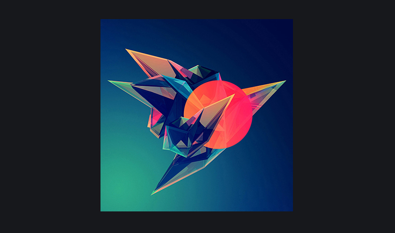
6. A home page that doesn’t drain the energy from your eyeballs. Sensitive types might say a majority of web sites feel as if they were constructed to assail and sap your brain with a fantastic array of ugly clutter, hidden tracking widgets and cookies, and sales and marketing traps that try to abscond with as much personal data as they can wrestle from your computer. Many take a long time to load as they pile up the background software, auto-run animations and unwanted videos that start themselves involuntarily. This is a corruption of design and user autonomy! It is an interface designed not for you, but more of a “fuck you” from overzealous site owners who insist on click-baiting, ramming their marketing agenda down your throat and perpetually littering your Internet journey with useless drivel. Killing that noise is a worthy goal. In a way, dem411 celebrates the lost art of the “empty” home page—a digital oasis promoting the mind with deep, contemplative spaces and reflective geometric symbols hinting at topographic maps in wire-frame, or a black hole event horizon.

PART III: Practical Insight on Development and WordPress
1. Good developers lurk in unlikely places. It’s wise to preface the exhaustive search for outside collaborators by hashing out your directional ideas well ahead of time. First, try to look at every existing web site that comes close to what yours wants to be. Find inspiration in them, but also pull devil’s advocate and inquire as to what they lack even in the best case scenario. Employ the Socratic method and alight a constructive internal debate. Then create the better version from your mental notes. In my case, this background process was meticulous and took weeks to complete. Once the concept gels in your head, inventory the details on a spec sheet or list of instructions—you have to set the flight path from scratch. From there, you are ready to search for a design/development team, or perhaps just one person who can do both. My process required 60-80 hours of investigation and sorting out via phone calls, rounds of RFP and repeated trips through the process-of-elimination gauntlet.
After winnowing down to 30 designers or design firms that appeared to sync up well with my intentions (from a field of 100 or more initial forays), I made first contact and sent all of them my introductory materials, needs/wants, and price limit. These designers and groups were located mostly in San Francisco or Los Angeles, a handful in New York City, and an even smaller contingent in the US suburbs and hinterlands. Some of these candidates were overbooked, and barely gave a damn about my presence in their lives. Some were thoughtful but overburdened by various client obligations or perhaps lacked a clear comprehension of the spec. Unfit. Some specialize in business-facing presentation, while others know what artists and musicians are looking for. You must separate these groups and make the justified eliminations.
Roughly 80% of dem411’s overall design was preconceived at home, including mock-ups of the layout and visual anchors that hold everything together. As an entity of the mind, it was virtually finished before I even made the first call to a developer. For the rest, I found nice support from FLDTrace / Lucian Florian of Charlotte, North Carolina, who originally hails from Romania. We collaborated with a freelance graphic designer for a portion of the preconceived visual elements that I could not execute on my own software.
2. Sound the klaxons, map out production roles and engage the project! Our turnaround time was roughly 11 weeks, from late November 2014 to completion in mid-February 2015. The graphic designer was only on board for one or two of those weeks. Each phase of the site-building process was blocked out in strict time slots estimated at the beginning of the job. The contract was clear, no hidden costs, and a top value considering how much work went into construction and refinement. Even as I knew what I wanted in granular detail, FLDTrace augmented my directives with a high level of technical creativity, which made the concept whole. After the third or fourth week, the iterative changes started layering themselves into the desired form.
The build quality, both in terms of utilitarian design and the austerities of back-end coding/implementation, was stable and harmonic. Technical and aesthetic issues came up frequently but were just as quickly resolved via on-the-fly adjustments and troubleshooting. The most problematic issues were external—browsers, appearances on different monitors/devices/systems and other glitches that are often beyond the developer’s control. This is perhaps more evident when working with the latest RWD and WP customization techniques, where standards-based or legacy limitations exist despite their extraordinary power to convey your web content. Finding the boundaries is hard-won knowledge. We attacked the project with a sense of wonder and enjoyment, which comes with let-downs as side effects. They briefly interrupt a busy kind of pleasure among the team. Traction and morale is upheld despite the stress, and we stay on target through the stepwise progression, all the way to the launch pad. A little controversy can be a fine companion so long as there’s a key secret ingredient called Good Chemistry on hand. Learn each others’ limitations; avoid lecturing, being pushy or overarching; prioritize well; give constructive criticism and foster a virtuous feedback loop. The most intelligent working groups are the ones who understand this delicate balance and sense how to “give and take” in just the right measures. They signal intentions and know when to stand back and let someone else do the driving. The meta on this skill suggests no one is leading or following when everyone is asserting their own strengths at precisely the right moment.
3. The ghost of Johannes Gutenberg loves WordPress…even if it heavily constrains our design choices. WP is incredibly powerful software and the ultimate low-cost CMS for web site creation. If Gutenberg had lived to be 600, I imagine a wave of revelatory joy would have enveloped the man as he laid eyes on WordPress. This back-end miracle is the Keyser Söze you’ve been looking for. Everything else is Roger “Verbal” Kint.
Although WP as a CMS engine is essentially peerless (for now), its primary constraint in the designer’s eye is its inherent “block-by-block” logic. This convention makes web content infinitely expandable but it simultaneously relegates you to a vertical “scroll” style that you generally cannot alter without dire technical consequences. Most of us can see this useful but cookie-cutter effect in the millions of standardized, free WP templates that serve the core public good of helping everyday people cheaply crank out web pages. A lot of what’s out there looks exactly the same; yawners. It’s not broken, but WP’s most clear and present danger is that it can feel boring or as if all users play the role of “template lemmings.” In order to depart from convention and elevate WP’s quotidian visual essence, dem411 was built with a custom template that includes many unique controls for specialized font and layout enhancements within the back-end strictures of WP and, beneath it, CSS. Most of what you see here is movable, customizable, expandable and upgradable, yet unlike many other WP sites all of dem411’s back-end “content buckets,” layout specs, drop-down WP menus and other visual details were programmed to enhance WP so that it comes closer into alignment with the designer’s mindset. This bespoke tool promotes originality and nurtures the delicate art of dramatic subtlety in form and function. It’ll take a lifetime to figure out if I can deliver on that platform, like any other.